I Built Two Better Woodblock Filters and Shipped the First One
Version two carved along the grain of every surface. Version three cut each region in its own direction and gave faces their own fine lines. Both fixed what they were aimed at, and both looked less natural than the plain diagonal hatch I started with.
Yunseon Hong14 min read
The woodblock style in Hwagong is the default, the first thing anyone sees after picking a photo. It is also the simplest of the four styles: three ink tones and one set of diagonal lines across the whole picture. Over two days in October 2026 I wrote two replacements for it, each meant to look more like a real carved print. Then I deleted both and shipped the original.
This is what each version tried, what it fixed, and why the fixes were the problem. Every image below comes from my own test runs on CC0 photos from Wikimedia Commons, at 1280 px on the long side.
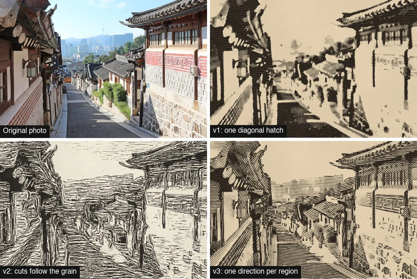
v1: one diagonal hatch, and it worked everywhere
The first version flattens the photo, splits it into three tones, and fills the middle tone with straight hatching at 30 degrees, wobbling slightly so the lines look cut rather than ruled. Dark areas are solid ink, light areas are bare paper. On a Mac it took about 0.22 seconds per photo in Python.
Night shots came out mostly ink, but nothing on the sixteen test photos came out broken. That was its main strength, and I undervalued it. My complaint was that it looked like a filter. Every surface got the same lines at the same angle, so a roof, a wall and a face were all carved the same way. A woodcut artist does not do that.
I had six reference images to aim at, woodblock prints I had generated with ChatGPT and kept for internal comparison only. Next to them, three differences stood out. In the references the cuts follow the form: horizontal on a floor, vertical on a pillar. Outlines hold the face, hands and clothes. And light walls still carry a few sparse cuts, so the tones run continuously instead of jumping from ink to paper.
v2: cuts that follow the grain, which read as scribbles
Version two went after the first difference. For each pixel it estimated the local direction of the image with a structure tensor, then used line integral convolution to smear noise along that direction. The smeared noise became carved strokes that curve with the surfaces. Canny edges drawn from a less flattened copy of the photo added outlines.
Getting it to work at all took a few rounds. If the integration step was larger than the noise grain, the cuts came out dotted, so I fixed the step at 1.5 px. On leaves and fur the direction field swirls, and with a weak pull toward horizontal the cuts turned into marble. A stronger pull fixed that. Blurring the background to quiet the foliage also erased the door frames behind a person, so I swapped the blur for heavy edge-preserving smoothing that kept the big shapes.
The results improved on some photos. An indoor portrait and a mountain read as prints for the first time, with cuts running along the slopes. Then I looked at the whole sheet again and called it what it was: not good enough to ship. The cuts came out at random lengths and widths, so most surfaces looked scribbled over, and the Canny outlines broke into short shaky pieces. It was also more than three times slower than v1.
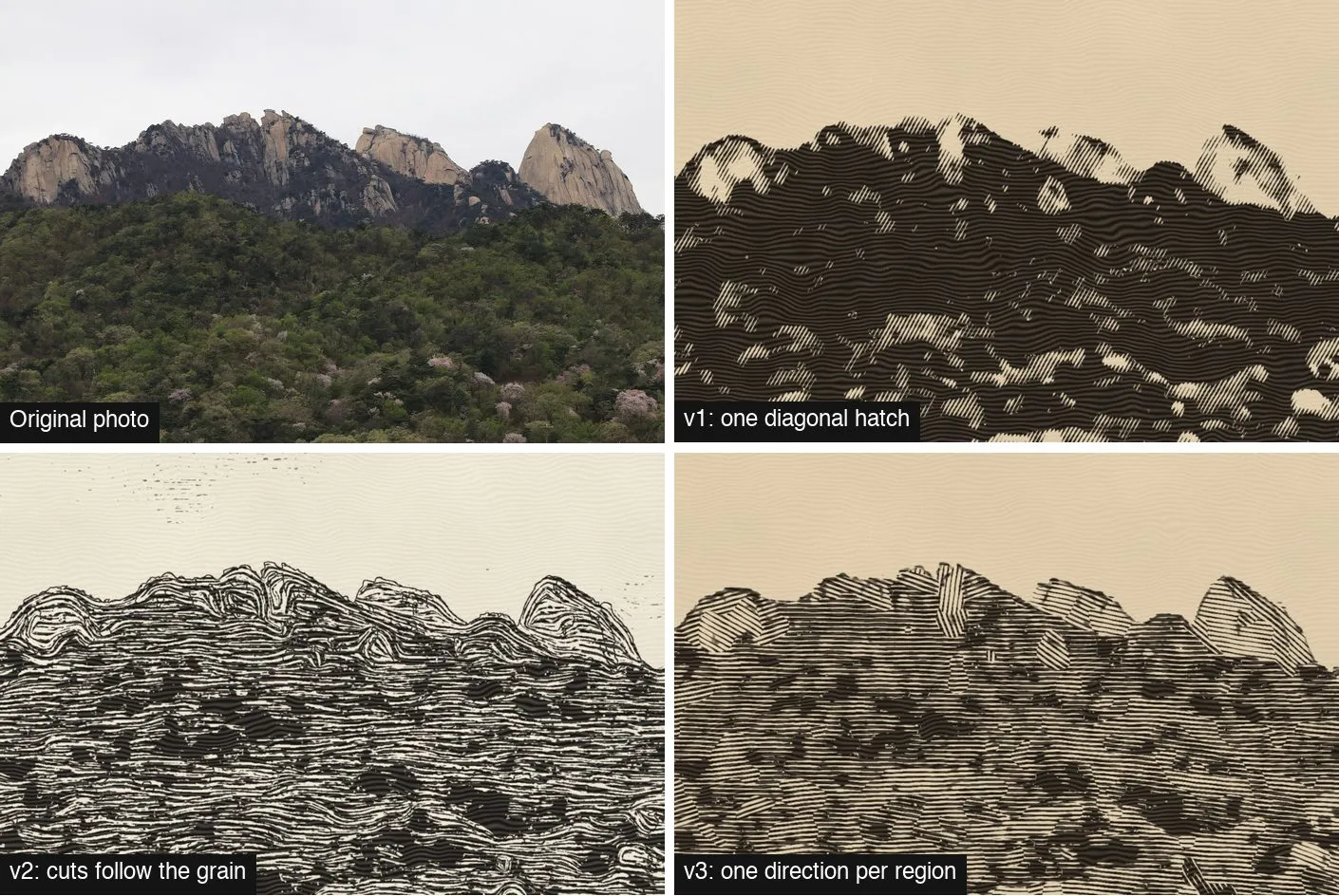
v3: one direction per region, plus a face
The diagnosis for v3 was that a woodcut is not strokes following a flow. The carver divides the block into areas and cuts each area in one direction. So v3 did that literally. It split the photo into four tones, cleaned the boundaries with a mode filter, and took each connected area as a region. Each region got one angle from its summed structure tensor and a set of straight parallel lines, with tone carried by line width. Outlines switched from Canny to FDoG, which smooths the edge response along the flow and gives unbroken lines.
The details took most of the time, and most of them were failures first:
- Lines 5 px apart turned the image gray, like a banknote engraving. Woodcuts need thick lines; 9 px worked.
- Background regions with no strong direction drifted to horizontal grain. Forcing every background region horizontal wiped out the door frame behind a person.
- Removing all solid black from the background made a gray engraving instead of a print. Keeping 30% of it fixed that.
- Indoor photos of a bar and a candle got their whole scene flattened, because Vision picked a coat on a chair or the flame as the subject. Subject separation now runs only when there is a face or the subject covers at least 15% of the frame. That rule applies to every style in the app.
Faces got their own treatment, and that was where v3 went wrong in the most instructive way. Inside each face Vision found, the first version used fine lines spaced by the face’s height and laid at a fixed 15 degrees. Each face came out looking cut from another print and pasted on. The lines did not connect to anything around them.
The fix was to split lines instead of replacing them. The face spacing became the outside spacing divided by a power of two, with the same angle, origin and wobble as the background. The outside lines run straight into the face, and new lines appear between them. I also stopped darkening faces with lines at all. Faces were brightened, only on their lighter tones so sunglasses and hair stayed dark, and features were drawn with a thin, more sensitive FDoG line.
At full resolution this got close to the references. A 12 MP render of an elderly woman’s portrait showed wrinkles, eyes, hands and a bracelet, because the face was three times larger than in the preview and the splitting rule added more lines. A dog’s eyes and ears got sharper too, once I built a head box from Vision’s animal body pose joints. That one render took 10.3 seconds in Python.
Why I went back to v1
I put the three versions side by side on all sixteen photos and judged them as a user would: does this look like a woodblock print, or like a filter trying to be one?
| v1 | v2 | v3 | |
|---|---|---|---|
| Idea | One diagonal hatch | Cuts follow the local grain | One direction per region, split lines in faces |
| Python, 1280 px | 0.22 s | 0.72 s | 0.67 s |
| Worked on | All 16, night shots heavy | Indoor portrait, mountains | Most photos except dark interiors and blurry food |
| What looked wrong | Same lines on every surface | Scribbles, marbled foliage, broken outlines | Region seams, patterned areas where lines cross |
v3 was clearly a better print on some photos. It was also visibly made of decisions: here the algorithm chose a region boundary, there it chose an angle, and when it chose wrong, the eye went straight to it. v1 makes no local decisions, so it can’t make a local mistake. It is less specific, and it is never strange. For the default style of a free app that has to work on whatever someone photographs, never strange is worth more.
The bigger reason is that the gap to the references was not about lines. What made those images look carved was a designer’s judgment: leaves reduced to a few shapes, fur turned into a pattern, unimportant parts left out. I could keep improving how lines are cut, but no rule about cutting would make that choice about what to leave out.
I deleted the v2 and v3 code. Before and after the cleanup, all sixteen v1 outputs were identical pixel for pixel, and the deleted code is still in git history if a better idea comes along.
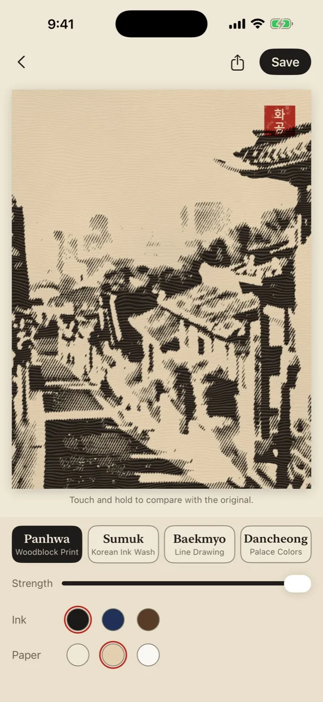
What v1 kept from the other two
Not everything went in the bin. The shipped woodblock style uses the warm aged paper color from v3, which did more for the print look than any change to the lines. It uses subject separation, with the background smoothed rather than blurred, from v2. And it uses the “face or 15% of the frame” rule. Those are the changes that made v1 better without making it more opinionated.
After the port to Metal, the shipped style draws a 1280 px preview in 34 to 51 ms on an iPhone 17 Pro and saves a 12 MP photo in under a second. If I come back to the woodblock style, I won’t start with the lines. I’ll start with a way to decide what to leave out.
Filed under Build log